

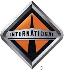
More the hexagon but really the whole thing. Maybe they are kind of trying to play off the International trucks diamond logo and colors?Are you referring to the S of the logo, the strange hexagon, or the entire thing? I don’t personally jive with the hexagon.
Scout Color Poll #1
- Thread starter Jamie@ScoutMotors
- Start date
-
 From all of us at Scout Motors, welcome to the Scout Community! We created this community to provide Scout vehicle owners, enthusiasts, and curiosity seekers with a place to engage in discussion, suggestions, stories, and connections. Supportive communities are sometimes hard to find, but we're determined to turn this into one.
Additionally, Scout Motors wants to hear your feedback and speak directly to the rabid community of owners as unique as America. We'll use the Scout Community to deliver news and information on events and launch updates directly to the group. Although the start of production is anticipated in 2026, many new developments and milestones will occur in the interim. We plan to share them with you on this site and look for your feedback and suggestions.
How will the Scout Community be run? Think of it this way: this place is your favorite local hangout. We want you to enjoy the atmosphere, talk to people who share similar interests, request and receive advice, and generally have an enjoyable time. The Scout Community should be a highlight of your day. We want you to tell stories, share photos, spread your knowledge, and tell us how Scout can deliver great products and experiences. Along the way, Scout Motors will share our journey to production with you.
Scout is all about respect. We respect our heritage. We respect the land and outdoors. We respect each other. Every person should feel safe, included, and welcomed in the Scout Community. Being kind and courteous to the other forum members is non-negotiable. Friendly debates are welcomed and often produce great outcomes, but we don't want things to get too rowdy. Please take a moment to consider what you post, especially if you think it may insult others. We'll do our best to encourage friendly discourse and to keep the discussions flowing.
So, welcome to the Scout Community! We encourage you to check back regularly as we plan to engage our members, share teasers, and participate in discussions. The world needs Scouts™. Let's get going.
We are Scout Motors.
You are using an out of date browser. It may not display this or other websites correctly.
You should upgrade or use an alternative browser.
You should upgrade or use an alternative browser.
It looks better without the hexagonOkay I have a question. I always have questions. Is it the color combo? The shape of the S? The shape of what the S is in?
Because that S is all over the Scouts. Here’s just a couple examples.
View attachment 13802View attachment 13803

The shape of the S and the hexagon. I don’t really care for it in the circle seal patches either. That’s one reason I’ve steered clear of some of the merch. It’s just a different opinion. Don’t skewer me too bad!Okay I have a question. I always have questions. Is it the color combo? The shape of the S? The shape of what the S is in?
Because that S is all over the Scouts. Here’s just a couple examples.
View attachment 13802View attachment 13803

Maybe that’s because you’re just seeing as an S and not a river through the hills or whatever it’s sort of look likeThe shape of the S and the hexagon. I don’t really care for it in the circle seal patches either. That’s one reason I’ve steered clear of some of the merch. It’s just a different opinion. Don’t skewer me too bad!
As a designer it’s not my favorite. Love the orange and the ‘S’ / endless road/on-ramp but the hexagon is a bit odd. But just my opinionSo, this is not exactly a color poll thought. And, yes, @J Alynn, I used the search function first. Does anyone besides me just not like this logo ? View attachment 13798
That is why he asked. What do you like or not like?Okay I have a question. I always have questions. Is it the color combo? The shape of the S? The shape of what the S is in?
Because that S is all over the Scouts. Here’s just a couple examples.
View attachment 13802View attachment 13803
The hexagon is my biggest hesitationThe shape of the S and the hexagon. I don’t really care for it in the circle seal patches either. That’s one reason I’ve steered clear of some of the merch. It’s just a different opinion. Don’t skewer me too bad!
I really like the S on the wheels and seats, etc. I liked the old logo the had on their Instagram posts. Scout spelled out in a circle.That is why he asked. What do you like or not like?
It appears white on the my iPhone and I think that the hexagon looks a little cleaner in white, but the S design is perfect, looks clean in Script from with the other letters and stands alone as logo in a pretty creative wayAs a designer it’s not my favorite. Love the orange and the ‘S’ / endless road/on-ramp but the hexagon is a bit odd. But just my opinion
Attachments
Now I like it there much better. Having the box around it helps.It appears white on the iPhone and I think that the hexagon looks a little cleaner in white, but the S design is perfect, looks clean in Script from with the other letters and stands alone as logo in a pretty creative way
Thinking about it Im guessing the goal is to get that S as recognizable as the Honda H or any of the other badges.It appears white on the my iPhone and I think that the hexagon looks a little cleaner in white, but the S design is perfect, looks clean in Script from with the other letters and stands alone as logo in a pretty creative way
Better. But I can’t put my finger on what bothers me so much.It appears white on the my iPhone and I think that the hexagon looks a little cleaner in white, but the S design is perfect, looks clean in Script from with the other letters and stands alone as logo in a pretty creative way
Yeah the old scouts had International Harvester “IH” as the brand badge, and the Scout script was more just a name plate. Now Scout is the brand and needs to sit alongside the big Blue ovals, Bowties, Ram heads, and CompassesThinking about it Im guessing the goal is to get that S as recognizable as the Honda H or any of the other badges.
Could it be the number of edge contacts that the S makes with the hexagon itself, breaking the hexagon into multiple parts for the outer color to bleed through?Better. But I can’t put my finger on what bothers me so much.
Or from looking at the design on the patch, maybe it’s the hard cut on the lower left of the S since for me looking at it. It looks a little odd instead of just having the entire smooth curve go through and then loop back across for the logo, but the lower portion there gets hard cut and it just looks a little strange
That’s certainly part of it. I did that drawing of the SM in the same lock up as the IH and it just seemed more correct. Heck, if the hexagon were a diamond that would make more sense as it’s in the same family as international trucks. But, I guess Rivian is a diamond logo already.Yeah the old scouts had International Harvester “IH” as the brand badge, and the Scout script was more just a name plate. Now Scout is the brand and needs to sit alongside the big Blue ovals, Bowties, Ram heads, and Compasses
Attachments
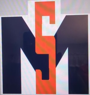
Yeah, is almost like it doesn’t fit in either the hexagon or the circle.Could it be the number of edge contacts that the S makes with the hexagon itself, breaking the hexagon into multiple parts for the outer color to bleed through?
Or from looking at the design on the patch, maybe it’s the hard cut on the lower left of the S since for me looking at it. It looks a little odd instead of just having the entire smooth curve go through and then loop back across for the logo, but the lower portion there gets hard cut and it just looks a little strange
Exactly. No diamond. Like the Honda H and Hyundai H are really close. SM needs to be distinctive.That’s certainly part of it. I did that drawing of the SM in the same lock up as the IH and it just seemed more correct. Heck, if the hexagon were a diamond that would make more sense as it’s in the same daily as international trucks. But, I guess Rivian is a diamond logo already.
The hexagon isn’t as bad in that exampleIt appears white on the my iPhone and I think that the hexagon looks a little cleaner in white, but the S design is perfect, looks clean in Script from with the other letters and stands alone as logo in a pretty creative way
I feel like the S would look good standing alone , but the points that run off to the right would need to to round out in reasonable way
To me the circle was curvaceous like the ‘S’. Mixing curves and hard lines bugs me a bitCould it be the number of edge contacts that the S makes with the hexagon itself, breaking the hexagon into multiple parts for the outer color to bleed through?
Or from looking at the design on the patch, maybe it’s the hard cut on the lower left of the S since for me looking at it. It looks a little odd instead of just having the entire smooth curve go through and then loop back across for the logo, but the lower portion there gets hard cut and it just looks a little strange
Similar threads
- Replies
- 271
- Views
- 25K